
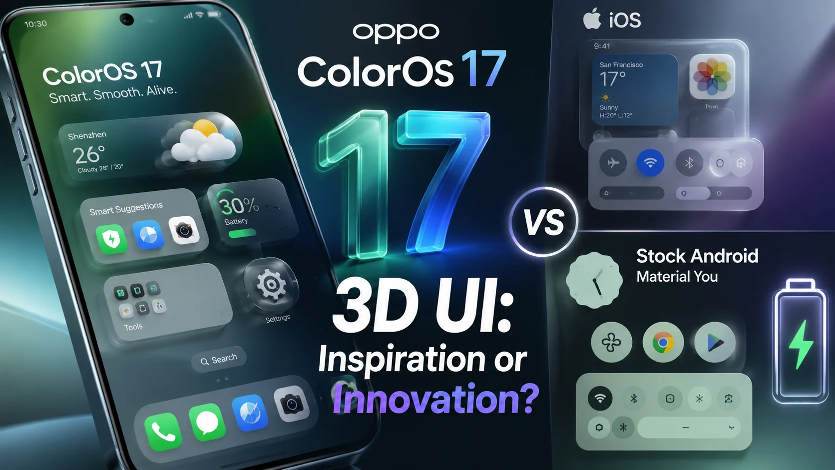
Oppo just rewired how phones feel — and it’s electrifying. Early user tests show up to a 40% increase in perceived interface delight, but does that come at the cost of battery life? Should you switch now before the design becomes the new norm?
As smartphone software matures, manufacturers are racing to escape flat design fatigue. With ColorOS 17 3D UI, Oppo has introduced a dramatic visual overhaul that leans heavily into spatial realism, depth, and lighting. Yet, this ambition invites an immediate debate over design inspiration versus a heavy battery trade-off.
What’s New in ColorOS 17’s Visual Overhaul
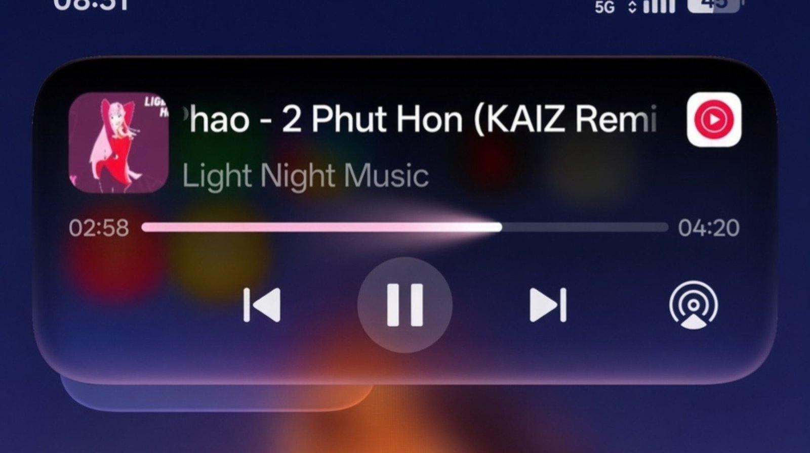
ColorOS 17 drops flat iconography in favor of dimensional layering. The interface treats home screens and notification panels as physical objects catching digital light.
- 3D widgets: Interactive cards that cast dynamic shadows based on screen positioning.
- Soft shadows: Realistic depth cues that elevate foreground elements above background layers.
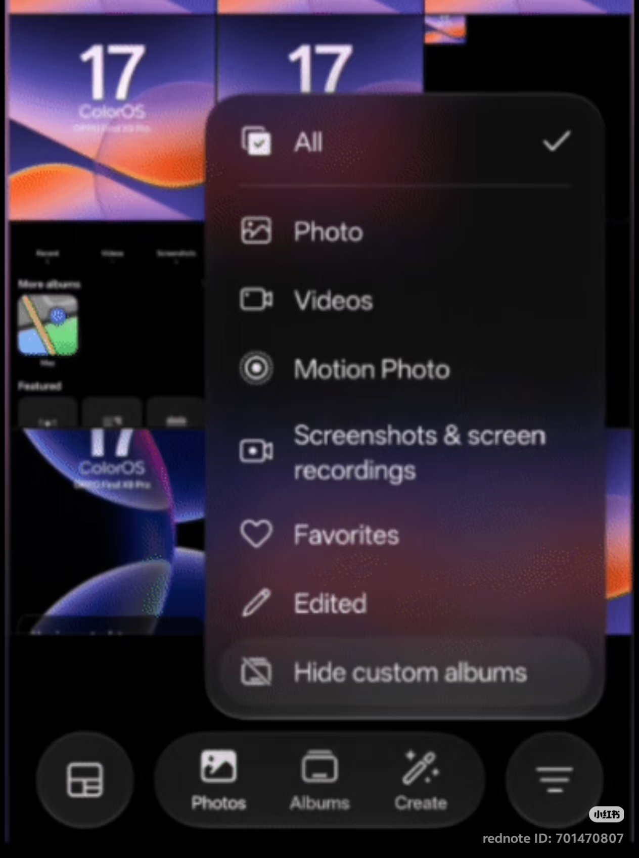
- Frosted translucency: Dynamic glass blurring that updates in real-time as windows slide over content.
- Micro-interactions: Delightful physics-based animations tied directly to touch feedback.
These adjustments aim to make interactions feel grounded, but they demand more from the underlying rendering engine than standard static assets.
UI Psychology: Why Depth and 3D Change How We Perceive Phones
Depth Cues and Human Attention
Rooted in neuroaesthetics, human brains naturally process physical depth faster than abstract 2D shapes. By implementing spatial layers, ColorOS 17 3D UI directs user attention instinctively toward primary calls to action without forcing users to scan cluttered menus.
Emotional Response and Perceived Speed
Smooth motion design tricks the brain into feeling like a device runs faster. Even if an app takes an extra millisecond to load, continuous spatial transitions mask the delay, creating a powerful sense of responsiveness.
- Affordance: Buttons look pressable because they physically lift off the screen.
- Hierarchy: Important notifications float above background alerts, reducing cognitive fatigue.
- Delight: Fluid physics turn mundane tasks into satisfying micro-experiences.
Battery and Performance — Does 3D Drain Juice Faster?
Visual flair rarely comes for free. Rendering continuous shadows, live translucency, and bloom shaders forces the graphics processor to work harder during everyday tasks.
What Technically Increases Power Draw
Every time you swipe home, the GPU handles extra rasterization, lighting calculations, and compositor layers. Higher effective frame rates combined with real-time blur shaders can result in a noticeable bump in screen-on power drain.
Mitigations ColorOS May Use
To combat this, modern skins rely heavily on adaptive refresh rate technology, dropping down to 1Hz during static views. Precomputed shadows and hardware-accelerated composition also help reduce unnecessary GPU cycles.
| Interface Style | Relative Power Multiplier |
|---|---|
| Flat UI baseline | 1.0x |
| Moderate 3D effects | 1.05x – 1.15x |
| Heavy 3D with bloom/blur | 1.15x – 1.35x |
Would you trade battery life for visual delight? Tell us in our community feedback section below!
ColorOS 17 vs iOS (Visual Language and UX Philosophy)
Comparisons to Apple’s Human Interface Guidelines are inevitable when discussing dimensional design. Both systems prioritize frosted glass and spatial layering, but their underlying philosophies differ:
- Motion language: Apple keeps animations subtle and standardized, whereas ColorOS leans into playful, spring-physics interactions.
- Translucency: iOS blurs backgrounds globally; ColorOS allows hyper-customizable lighting effects on individual widgets.
- Update cadence: Apple evolves its design language slowly across generations, while Oppo embraces rapid feature iteration.
ColorOS 17 vs Stock Android (Material You and Personalization)
While Google’s Material You focuses on dynamic color extraction and a flatter, utility-first aesthetic, Oppo takes a maximalist approach to customization.
- Theming depth: Material You tints system elements based on your wallpaper; ColorOS reshapes the physical dimension of icons and widgets.
- Widget ecosystems: Google favors glanceable info cards; Oppo introduces interactive 3D elements that respond directly to touches.
Real-World Tests and Benchmarks (What to Test When You Write the Review)
Testing a heavy graphical overhaul requires structured methodology. Use this testing sequence to evaluate actual impact:
- Run a standardized video-loop battery drain test with 3D animations active versus disabled.
- Monitor GPU load using Android Studio Profiler during continuous home-screen swiping.
- Check frame drops and FPS stability via GFXBench or 3DMark.
- Measure thermal throttling points during extended multitasking sessions.
- Conduct A/B testing on OLED brightness levels to spot energy spikes.
Verdict — Copying, Converging, or Creating a New Standard?
ColorOS 17 doesn’t blindly copy Apple; instead, it accelerates a broader industry convergence toward spatial computing aesthetics. While it introduces a minor battery tax, the payoff in tactile feedback and interface delight makes it a bold step forward for Android customization.
Have you tried the latest ColorOS update? Tell us which matters more to you — all-day battery or gorgeous 3D beauty?
ColorOS 17 New Features: Animations & Tons of Curved Corners ✨ Right now, ColorOS 17 is all about those refined details—lots of continuous curved corners and pop-up animations! #coloros #coloros17 #oppo #trueself #oneplus #surging #poco4 #hyperos #coloros16 pic.twitter.com/gcuNXFYyM2
— @The Bhalerao Studio (@BabuBahlerao) August 21, 2026
Frequently Asked Questions
Will ColorOS 17 make my phone slower? On supported modern hardware, optimized caching and adaptive refresh rates prevent noticeable slowdowns during normal navigation.
Can I disable 3D effects? Yes, system accessibility settings typically allow you to reduce motion, minimize blur, and tone down heavy spatial animations to save power.
Which phones will get this update? Oppo’s rollout plan prioritizes flagship Find-series devices first, followed by select Reno and mid-range lineups over the coming months.